
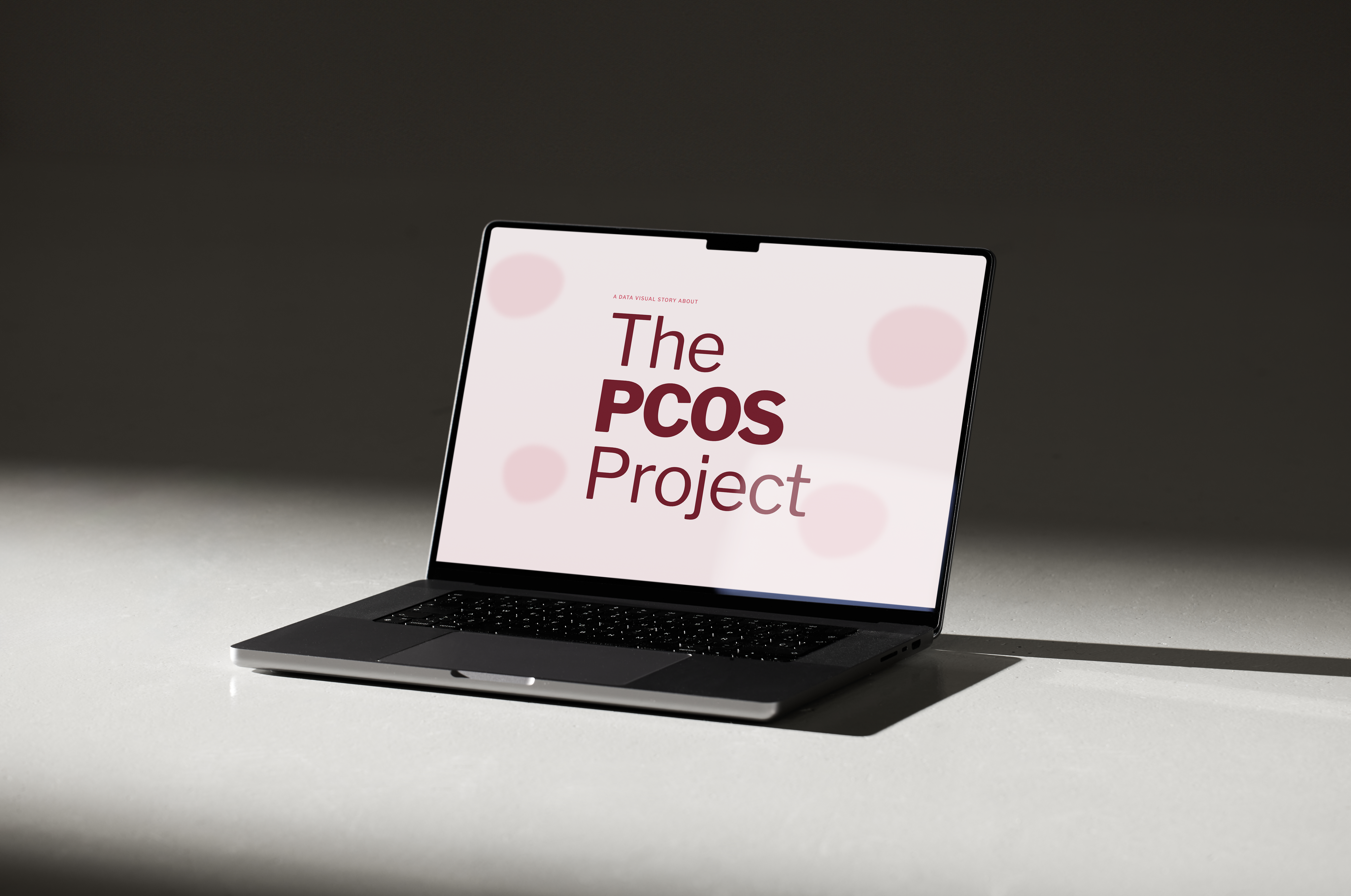
UX / WEB DESIGN
A digital platform designed to make PCOS information clearer, more accessible and easier to understand.
UX/UI Designer
Individual Project
Figma / Adobe CC
2026
ABOUT THE PROJECT
This project explores how digital design can make PCOS information clearer, more accessible and easier to navigate.
THE CHALLENGE
People with PCOS often face confusing, inconsistent and overwhelming information when trying to understand the condition. The challenge was to create a digital experience that feels trustworthy, easy to navigate and visually approachable.
RESEARCH
Research was used to understand how people currently access PCOS information, what creates confusion, and what users need from a clearer digital experience.
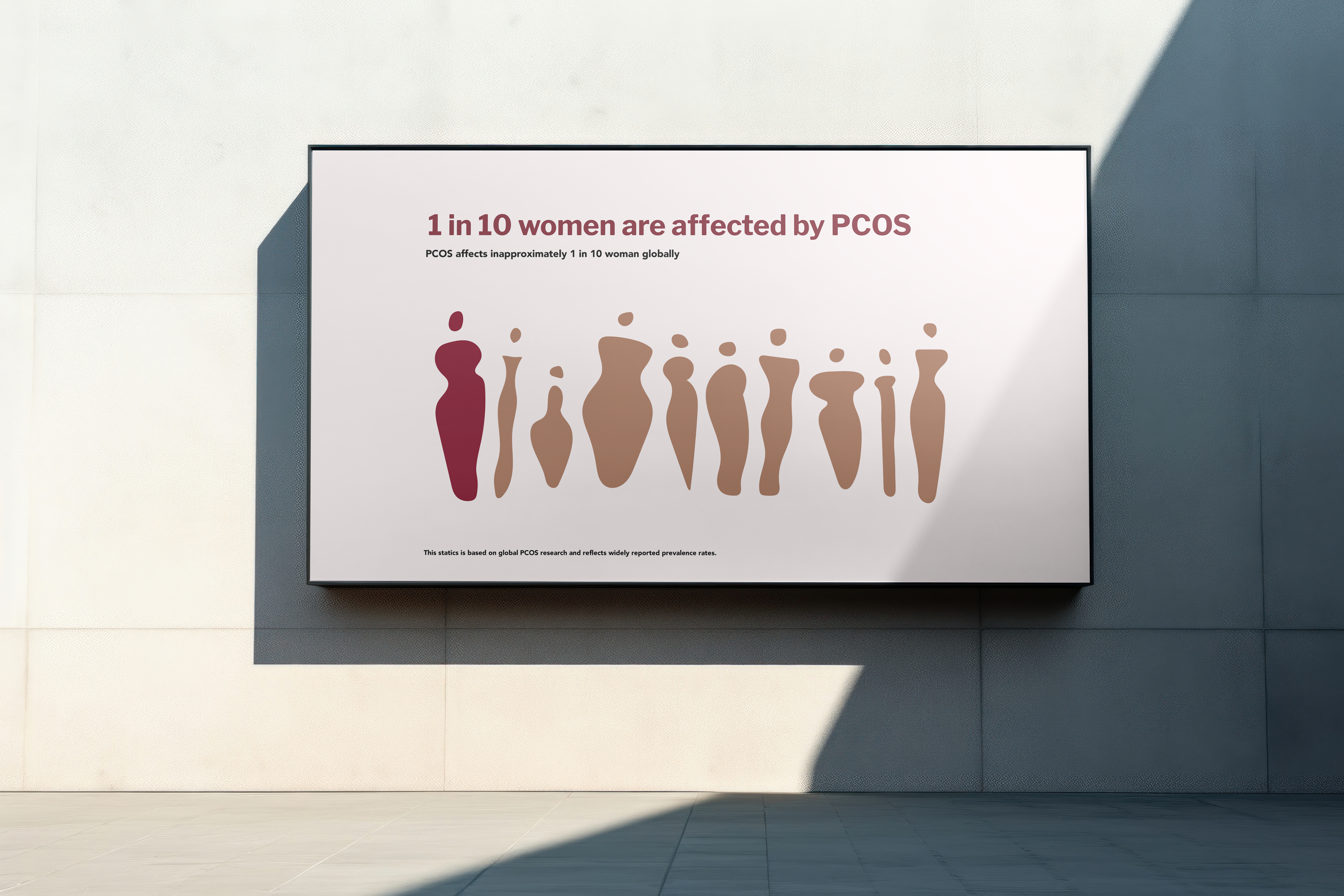
Women are affected by PCOS.
Experience difficulties related to diagnosis or understanding symptoms.
Symptoms differ significantly between individuals.
RESEARCH SUMMARY
The research was organised into key themes to highlight the most relevant findings and guide the visual direction of the project.
| Category | Insight | Evidence | Source | Visual Direction |
|---|---|---|---|---|
| Prevalence | How Common | Approximately 1 in 10 women globally | World Health Organization | 10 women with 1 highlighted |
| Diagnosis | Undiagnosed | Up to 70% remain undiagnosed | World Health Organization | Highlighted figures |
| Symptoms | Variation | Symptoms vary widely between individuals | NHS | Clustered circles |
| Hormones | Cause | Hormonal imbalance including elevated androgens | Mayo Clinic | Body map |
| Impact | Long-term Effects | PCOS can affect long-term health and fertility if unmanaged | World Health Organization | Data-led visual |
DESIGN GOALS
Based on the research insights, three core design goals were established to guide every design decision throughout the project.
Present complex medical information in a way that is clear, approachable and easy to understand.
Create a visual language that feels supportive, credible and reassuring for people seeking information about PCOS.
Organise content into a simple and intuitive structure that allows users to quickly find relevant information.
DESIGN PROCESS
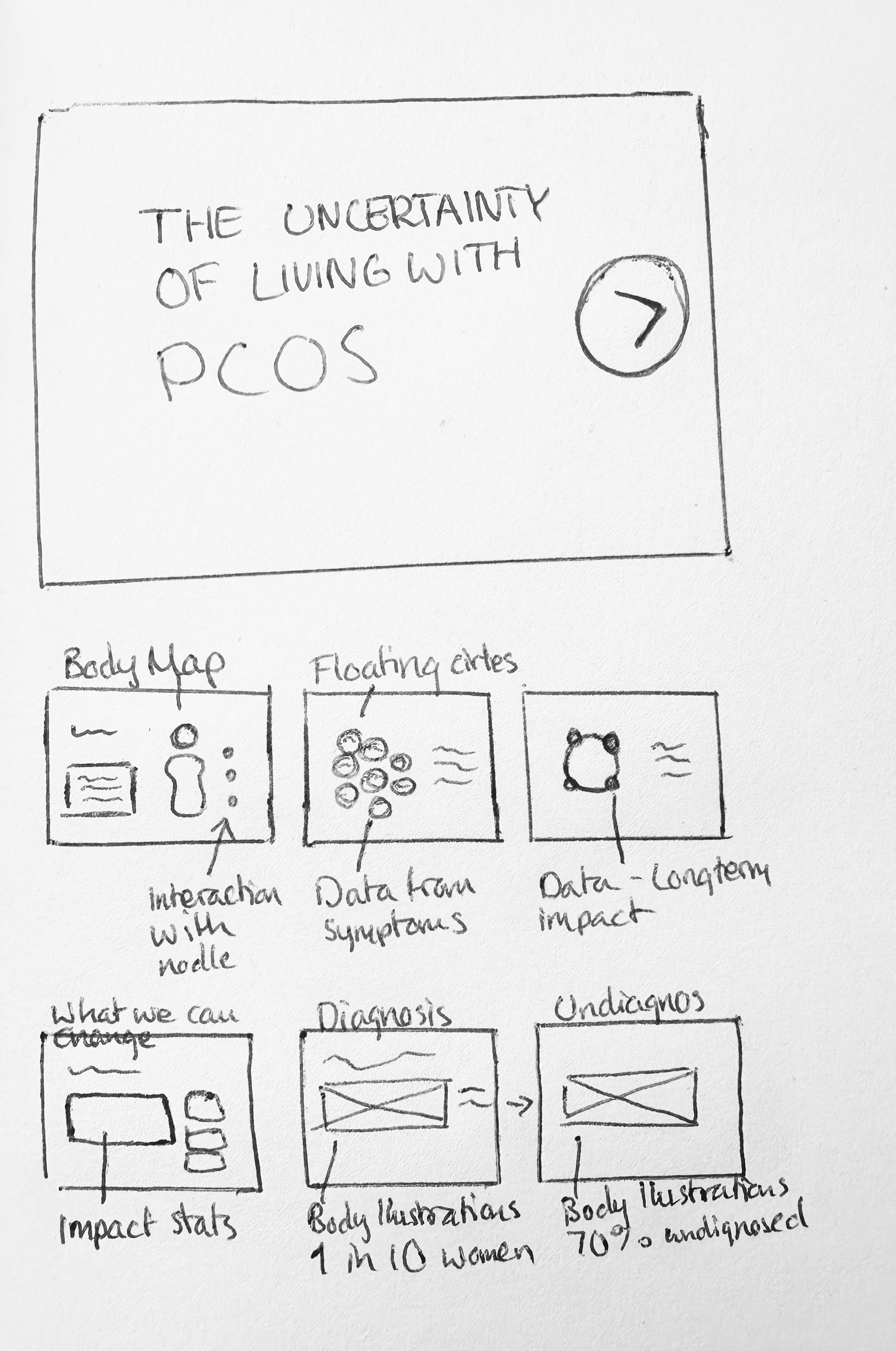
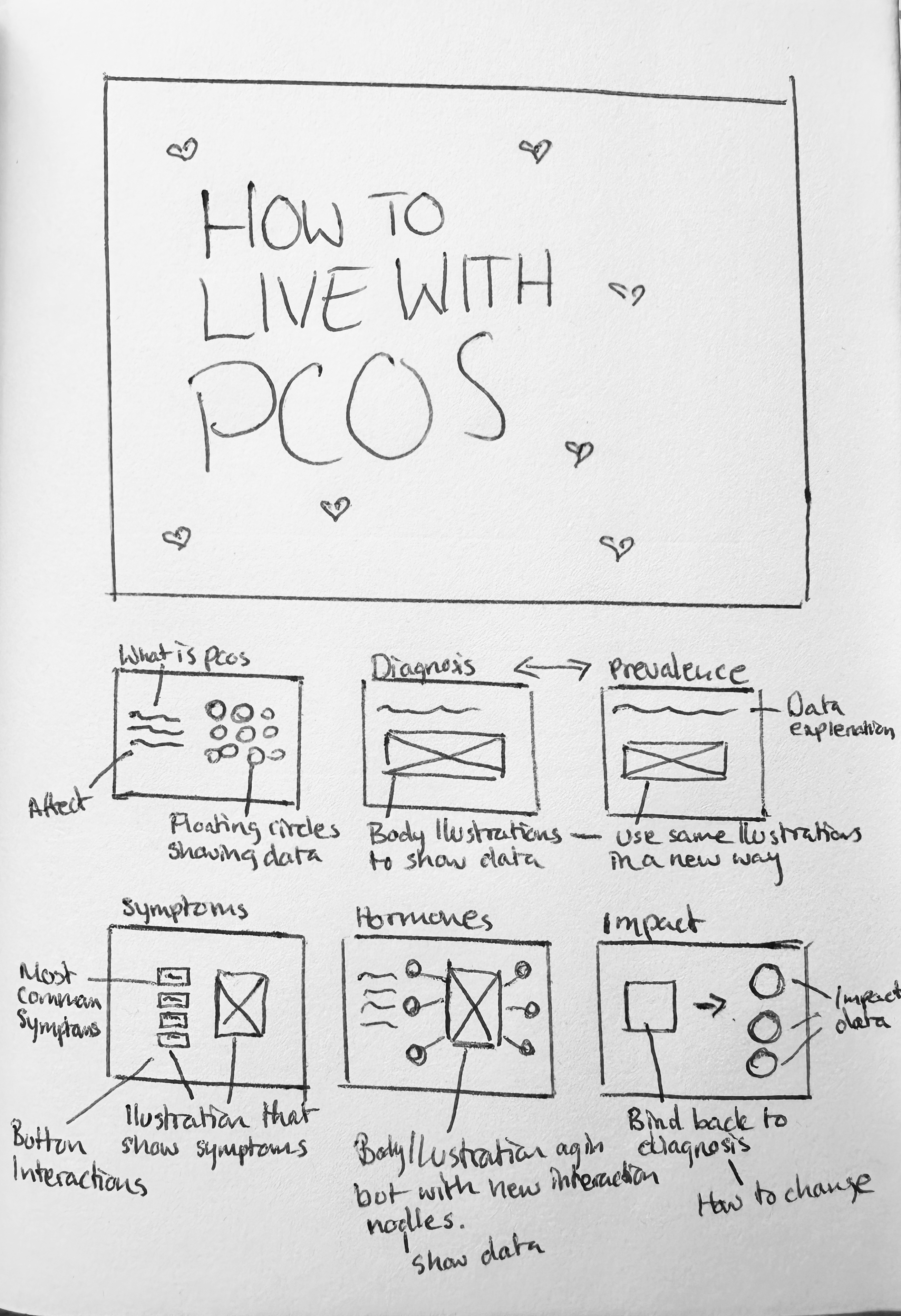
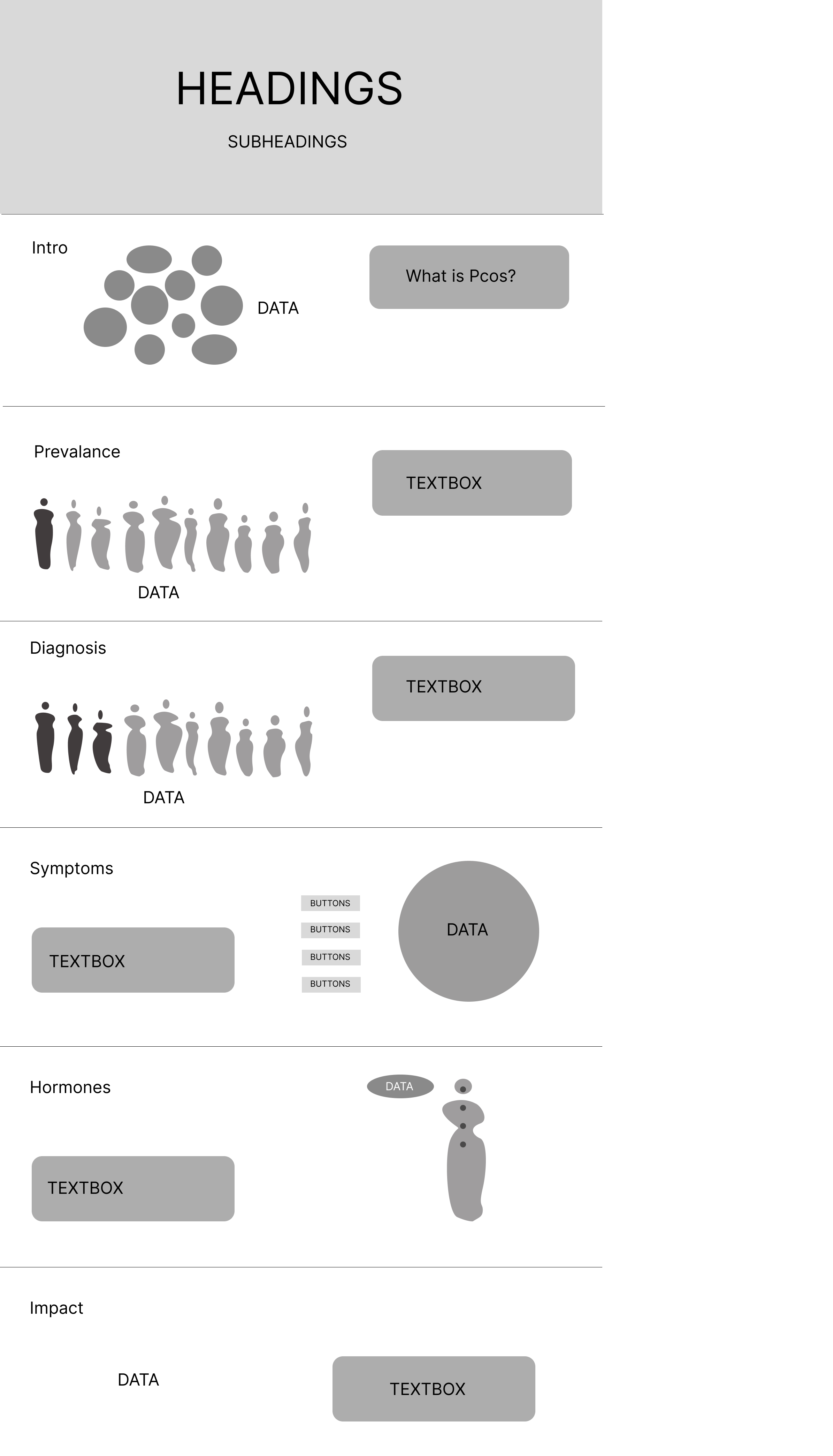
Before developing the final interface, early concepts were explored through sketches and low-fidelity wireframes. These iterations helped establish the information hierarchy, refine navigation and test different layout directions before moving into high-fidelity design.
Initial sketches were used to quickly explore layout ideas, content hierarchy and user flows.
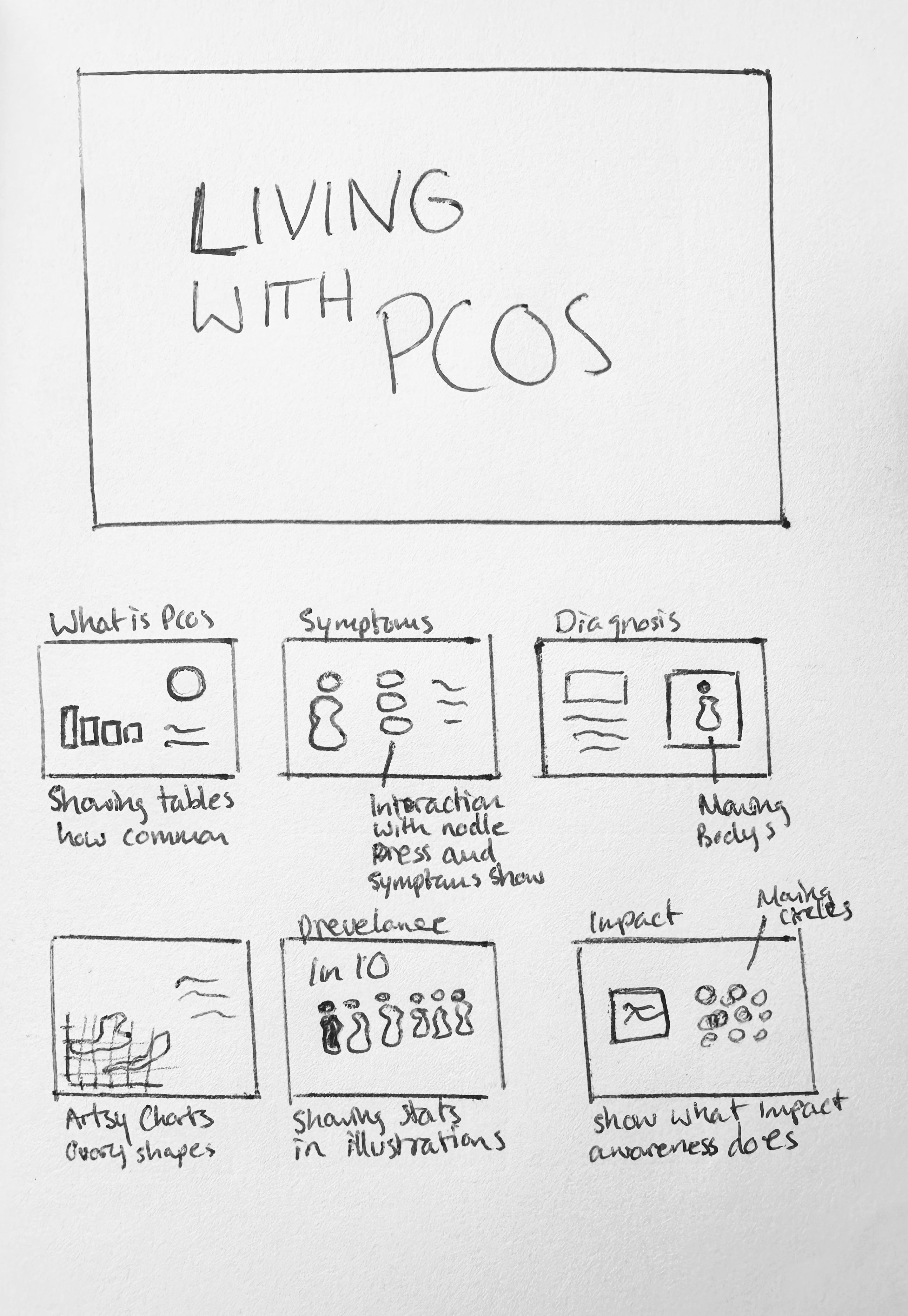
Low-fidelity wireframes were used to refine information hierarchy, navigation and page structure before moving into high-fidelity design.
VISUAL IDENTITY
The visual identity was designed to feel informative, supportive and approachable.
A warm colour palette, clear typography and organic graphic elements create consistency throughout the experience.
TYPOGRAPHY
Heading
Subheading
Body Copy
Captions
ABCDEFGHIJKLMNOPQ
RSTUVWXYZ
abcdefghijklmnopqrstuv
xyz
The typeface used is Libre Franklin, a clean and modern sans-serif chosen for its clarity and readability. Different font weights are used to create hierarchy, with bold for headings, semibold for subheadings, regular for body text and light for captions. This ensures the content is easy to navigate and visually consistent.
COLOUR PALETTE
Primary Colour
#76182Argb(118, 24, 42)Secondary
#944A56rgb(148, 74, 86)Secondary
#CE8F9Brgb(206, 143, 155)Primary Colour
#FFD1DArgb(255, 209, 218)Warm, calming tones that create trust without feeling clinical.
GRAPHIC LANGUAGE

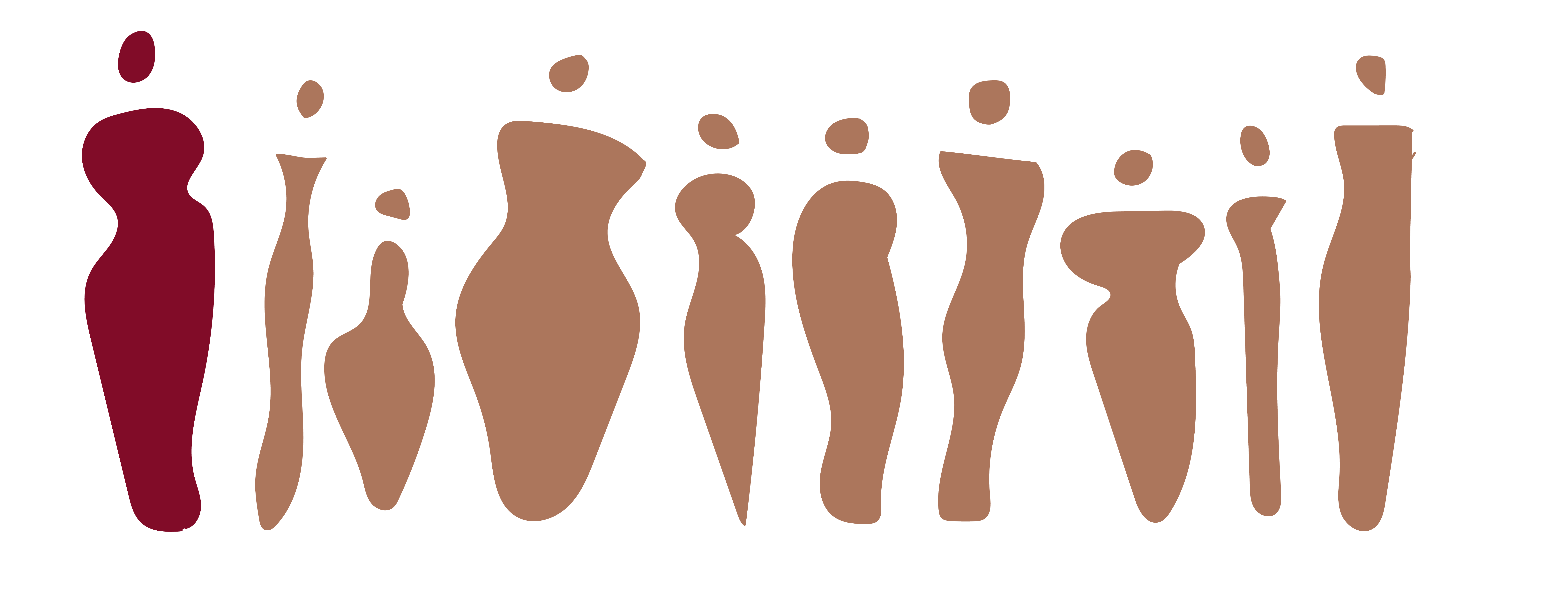
Soft circular forms inspired by hormones and organic body shapes are repeated throughout the interface to create consistency.
FINAL OUTCOME
The final outcome is a fully designed and coded responsive website, bringing the research, visual identity and interface design together into one cohesive digital experience.
VIEW PROJECTREFLECTION
This project strengthened my understanding of user-centred design, accessibility and information architecture. Through research, iteration and visual exploration, I learned how thoughtful design can make complex health information feel more approachable and easier to understand.
If I continued developing the project, I would conduct further usability testing with people living with PCOS to validate the navigation and refine the experience based on real user feedback.